Another thing, I’m not a huge fan of is cursive script in football. It just looks casual and flippant. Imagine if Barwis’ words were captured in a speech-bubble. That’s the font I want for my football t-shirt.
Finalhttp://www.blogger.com/img/gl.link.gifly, I’m a big fan of simplicity and empty space in graphic design. A lot of shirts get exceptionally busy and have way too much stuff going on (like the tiny “THE TEAM THE TEAM THE TEAM” in last year’s shirt).
I won’t vote yet (I think I have until March 11th to vote), but I’m leaning toward Front 2 and Back 1. It’s simple, bold, strong and doesn’t try to be anything more than a cool looking t-shirt.
Update: The contest is on!
Posted under Misc.
Tags: boring offseason, Football, I posted


I like both #1s. Front #2 is too simple, and back #2 just looks like complete shit.
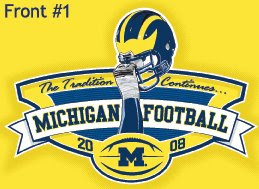
Shitty all around. Front 1 is too ornate, script fonts have no place on a college football shirt, and the actual helmet image (instead of the completely awesome wing abstraction from the 2003 design) reeks of retail clearance rack merchandising. The people who’d like this probably also have a “Go Wolverines” magnet in swoopy font on the back of their truck.
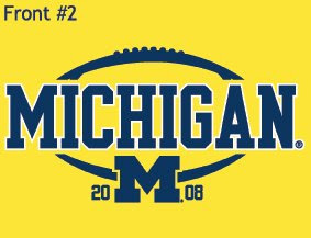
Front 2, that football doesn’t look like anything. Nice of them to use solid block lettering but that’s nothing I haven’t been able to buy from Steve & Barry’s.
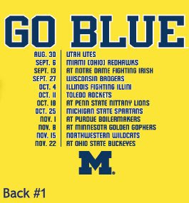
Back 1 is fine. That’s all you need. I liked the boastworthy data they’ve had on other shirts (bowl streaks, win %, etc) but that’s not only jinxing but it’s obsolete almost immediately.
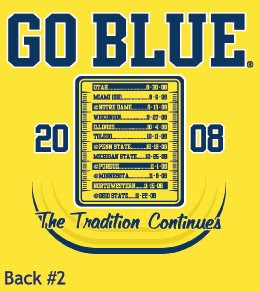
Back 2 alternates colors arbitrarily and it looks like an index card hovering above a toilet bowl in a foggy bathroom. And again with the Junior Adult Novel font.
“Why don’t you design better ones?” you ask? I did, for the 2005 contest, back when it was a contest, and not a Nike-sponsored Alumni Association promotion. But they picked the previous winner again and used her smeary oil painting shirt, and made it blue, against the will of the students.
The 2003 shirt was fantastic; the rest have been either bastardizations of good designs, or poorly contrived Michigan taglines shit out by the lowest bidder.
Yeah, I’m bitter about this. But at least it’s maize.
In all fairness, the shirt is now an Addidas-sponsored Alumni Association.
I’d much rather go too simple than too complicated and designed.
Front 2, Back 1.
Both are fucking awful. Yikes.
Front 2, Back 1…if I was forced to pick one out.
Give me 1 hour in photoshop and I kick out a far better design.
Might be an interesting competition Paul?
My first thought on #1 was “Whoa is the message that we can draw a particularly egregious facemask penalty?”
Second thought was “Wait, is he holding his head in dismay?”
Only the third thought was “Ohh he’s holding his helmet aloft.”
“The Tradition Continues…” is about the lamest shit this side of South Bend and ND’s “Return to Glory”.
Front 1
Back 2
If these are the only choices, I’ll take front2 and back 1